
Choosing Brand Colors That Do More Than Just Look Good

Color Theory Is More Than “Red = Excitement”
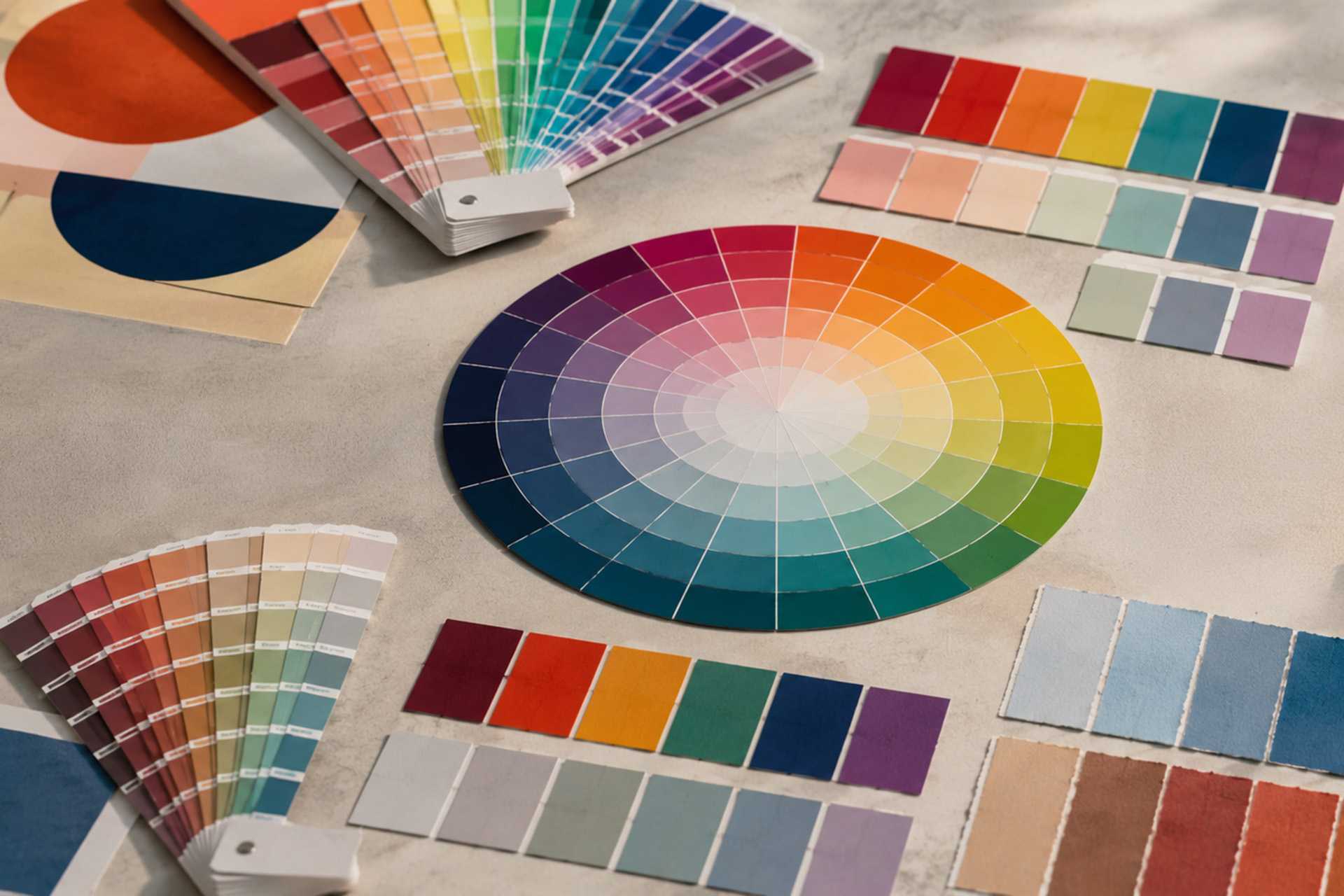
Color theory is the framework designers use to understand how colors relate to one another, how they combine, and how those relationships affect what we see and feel. It includes the familiar color wheel, but also the properties that make one version of a color behave very differently from another.
Every color can be described in terms of hue, value and saturation. Hue is the basic color family—red, blue, green and so on. Value describes how light or dark that color is. Saturation describes its intensity, from vivid and highly concentrated to soft, muted or nearly gray.
Color theory also gives designers ways to build relationships between colors. Complementary colors sit opposite one another on the color wheel and create strong contrast. Analogous colors sit beside one another and tend to feel more harmonious. Triadic palettes use three evenly spaced hues, while monochromatic palettes build variety through different values and saturations of a single hue.
These aren’t simply formulas for making something “look nice.” Changing the value, saturation or relationship between colors can dramatically alter the mood and energy of a design.
That’s where color psychology enters the conversation—but it’s only one piece of it. Red does not automatically mean excitement any more than blue automatically means trust. A dark, muted oxblood and a bright fire-engine red share a hue family, but they create very different impressions.
For a graphic designer, choosing a brand color isn’t just choosing blue. It’s choosing which blue, how it interacts with the colors around it, and what happens when that system has to work in the real world.
Your Industry Already Has Its Colors
There’s another kind of color psychology happening in branding: learned expectation.
Over time, industries tend to gravitate toward the same colors. Certain colors and combinations begin to look like healthcare, finance, technology, luxury, construction or children’s products simply because we’ve encountered them in those industries repeatedly.
That creates an interesting branding problem.
You need enough familiarity that your audience can quickly understand where your company belongs—but enough distinction to stand out.
That’s one reason professional brand development matters. An agency isn’t simply asking, “What colors look nice together?” A designer looks at your competitors, your audience, your positioning and the personality of your company to determine which familiar color choices help you—and which ones are worth breaking away from.
Sometimes the “wrong” color for your industry is exactly the right color for your brand.

And Then There’s the Technical Part
This is where choosing and using brand colors stops being about feelings and starts becoming a conversation about light, ink, math and materials.
RGB: Color Made With Light
RGB stands for red, green and blue, and it is the color model used for most digital applications: websites, social media graphics, digital ads, monitors, televisions and other screens.
RGB is an additive color model. A screen creates color by emitting red, green and blue light at different intensities. No light gives you black. Add more light and the color becomes brighter. Combine all three at full intensity and you get white.
HEX: RGB Written for the Web
HEX is the familiar code that looks something like #2F65A7.
Despite sometimes being listed alongside RGB, CMYK and Pantone as though it were another type of color, HEX isn’t another color model at all. It is a compact hexadecimal way of specifying the red, green and blue components of a digital color.
HEX became especially common because it provides a short, standardized way to specify exact colors in websites and CSS. That’s why brand standards often provide both RGB values for design applications and HEX codes for web and other digital uses.
CMYK: Color Made With Ink—and Viewed With Light
CMYK stands for cyan, magenta, yellow and black and is the basis of standard four-color process printing.
Unlike a monitor, a printed brochure doesn’t emit light. Ambient light hits the paper and ink, portions of that light are absorbed, and the remaining wavelengths are reflected back to your eyes. CMYK is therefore a subtractive color model: the more ink you add, the more light is absorbed rather than reflected.
That also means the light in the room affects what you see. A printed color viewed under warm residential lighting can appear different than the exact same piece viewed in daylight or under cooler commercial lighting.

The Conversion Problem
RGB and CMYK cannot reproduce exactly the same range of colors. A vivid color created with emitted light may simply fall outside the gamut, or reproducible range, of a particular CMYK printing condition. Converting it for print can require shifting that color to something the inks and press can physically reproduce.
Black is a perfect example of how complicated even a seemingly simple color can become.
On a screen, RGB 0, 0, 0 or HEX #000000 means no red, green or blue light is being emitted: black.
In process printing, 100% K black uses only black ink. A designer may instead specify a rich black, combining black with percentages of cyan, magenta and/or yellow to create a deeper appearance in large areas of color.
But rich black isn’t appropriate everywhere. Multiple printing passes on tiny text can create registration problems, while too much combined ink can cause drying and reproduction issues.
So yes—even black needs instructions.

Pantone: When “Close Enough” Isn’t Close Enough
Then there’s Pantone, or PMS.
Instead of building a printed color from combinations of cyan, magenta, yellow and black dots, commercial printing can use a spot color: a specially mixed ink printed as its own color.
That can provide tighter consistency for important brand colors and can reproduce some colors that standard CMYK printing struggles to achieve.
But now your brand may need several specifications for what is conceptually the same color: a Pantone spot ink for one application, a CMYK build for process printing, and RGB and HEX values for digital use.
Those aren’t always identical reproductions of one another. They are often the best practical versions of the same brand color within different systems.
And We Still Haven’t Put Ink on Anything
Because then there’s the paper.
Coated paper gives ink a different surface than uncoated stock. On a coated sheet, ink generally stays nearer the surface and can appear sharper and more saturated. On porous uncoated paper, ink absorbs farther into the fibers and colors can appear softer or duller.
The color of the paper itself matters too. The exact same ink can look different on bright-white, warm-white or natural recycled stock because the material underneath affects the light reflected back to your eye.
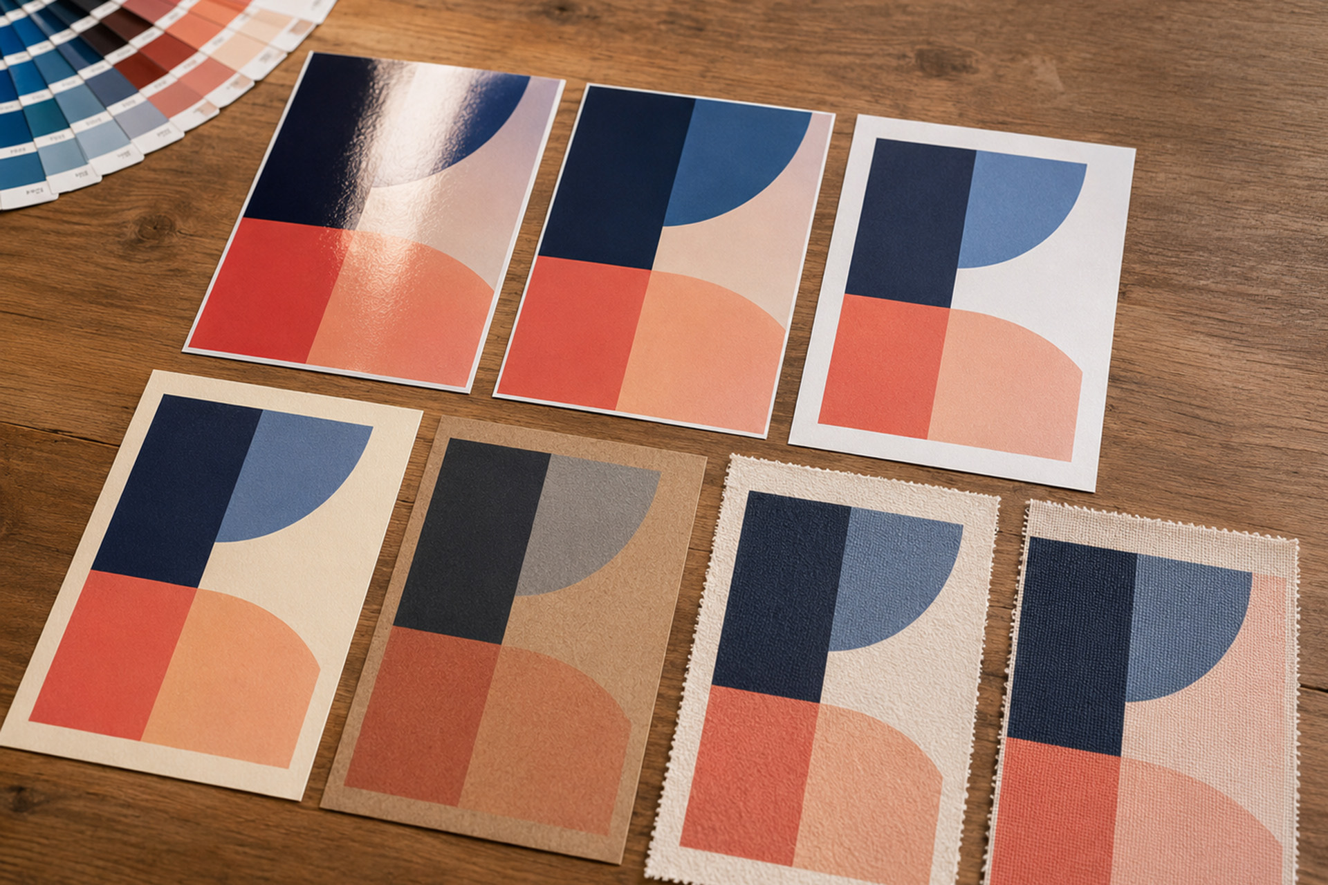
Then add gloss versus matte finishes, fabric, vinyl, plastic, cardboard, signage and promotional products.
Suddenly, the question isn’t:
“What’s our blue?”
It’s:
Which RGB or HEX value do we use? Which CMYK build? Do we need a Pantone color? What happens on coated versus uncoated stock? And what is the approved alternative when the original color simply can’t be reproduced in the chosen medium?
A professionally developed palette accounts for where the brand actually has to live. It establishes how colors should be specified, reproduced and translated across digital and physical applications.
Because brand colors need to do more than just look good.
They need to work—in every place your brand does.
Get started today!
Schedule your Intro Call with our team.


